

Of course, if you can't travel into the future, as Hawking says, all time machines are retro!
Made this one for RedOchre, and I had been waiting to do so, because I didn't have any fresh ideas that were worth really expanding, and for some reason, I wanted to do a time travel story, since she's apparently an anthropologist! Hopefully not an ancient one, because I went for a much closer time period culturally, as you can read in the story.
As mentioned in the post for her trading folder:
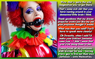
Was waiting for a good story to come through my brain for a caption for you, and in seeing this picture, I had my muse, so to speak. However, the story sort of got away from me length wise, and I only had one picture of the model, hence, its a bit more crowded than my usual caption.
Yes, it certainly did get away from me. I had written stuff, shrunk down the text (my font is usually set to around 30 pt, and this one ended up around 17.50 pt!) and then wrote some more. I really wanted to stress the trapped part because she's really into that. If not, I probably could have ended it a the vintage clothing line. However, I think that the story needed (and deserved) a bit more flesh on the bone. This is one of the few times I really wish I had another picture of the model so that I could've thrown half of the text into another panel.
I do think its a fun little sci-fi romp, and I hope you enjoy!
** This morning I found another picture of the model, so I went back to give the text more space. I ended up writing a few extra paragraphs, since the way I wanted to divide up the story made it so there were only two or three paragraphs in the second panel. I'm not sure that RedOchre will like it as much because the original was a bit bleaker in her entrapment, but I think that taking advantage of the situation presented while still being trapped makes it a bit more balanced. So here are the newly redesigned caption panels for you to peruse!**


I wasn't going to post tonight, but without any comments on the golf caption, and honestly I probably wouldn't comment on another persons golf caption either, I didn't want it sitting at the top for another day or two so I decided to put this one up, which I feel has really good story. We do hit dry spells occasionally and perhaps the last one posted needed to be a bit more moist!
DISCUSSION QUESTION: You tell me, was it too much text for the caption setting? Should I have edited it down or just leave it the way it is because its fine enough the way I posted it? Anything you didn't quite understand? *Which did you like better, the original or the redux?*


It is interesting how one panel captions can almost become a single illustration for a longer story. In this case, the story was compelling enough (and remained short) to allow the picture to almost fade into the background. That said, I've often said that I'm a little strange in these matters - preferring the story and the situation to the image in many cases. Not that the images aren't nice themselves, but I do like me some story and imagination.
ReplyDeleteIt's one of the reasons I find creating captions practically impossible, but I can illustrate a longer piece of prose more easily.
In short, the text was edited well but could have been left longer in places perhaps (though I accept that then it would be less a caption and more flash fiction with an image attached), because there was a *potential* lack of clarity around the terranium and the situation of the apartment that waited after time travelling. Mind you, I was able to fill in those blanks easily enough so...
Sorry, apparently early mornings bring out the overly analytical part of me!
It's a nice caption and apologies for being quiet around here lately!
The amount of text in a caption is always a diificult choice. Not coming from the ADD generation I tend to make the story about the picture and go the length it takes to tell it. I may be one of the few cappers that actually writes my caption into the cap space so I am looking at the picture the whole while I am writing. Like Dee I will stsrt out with a larger font and squeeze it down first before chopping my story.
ReplyDeleteSometimes I just can't squeeze enough and the story changes out of necessity. Sometimes the result is better and sometimes I wish I could show the director's cut. Blade Runner is a grest example of two versions, the original and the director's cut where people can argue which is better.
I actually prefer the more draconian original of Dee's cap just as I do the original 'Blade Runner' but can appreciate the expanded version but it makes it a different story.
Both are great versions of the story, the one panel has a more "Dee feeling" to it, but even though it had more writing than you usually have, it felt like it missed something. The two panels feel like the story is more complete.
ReplyDelete