

The picture totally wrote the entire caption for me. The pose and look on the model's face said, "help me please?" to me, and it didn't have the blunt sexuality that many "girls grabbing/cupping their boobs" seem to possess. There was an innocence to the expression and her face itself. Also, there was some soft boyish features present in the face and the hair, which made it seem like she wasn't QUITE fully changed yet. Its not often when you get a gift like this in picture form .. all that I described AND a wonderfully kick ass body to use in a caption.
When I make captions, I tend to use tall pictures (aka height is 2:1 ratio or so to width) so I can run a text box on the side. Pictures like this are harder for me, because I don't want to edit a photo this delicious, and the extraneous background lends credence to it being his sister's room. When I get pictures that are wider than tall, I tend to do one of two things.
One way is to have a more linear arrangement, where the picture goes exactly where it fits in the story time line. An example would be the first text section is the guy arguing about going to see a chick flick with her, and that she should find someone to go that would appreciate it more. Then I would put in a picture of a girl with tears running down her face. Then, I'd end it with the transformed boyfriend watching the movie with his girlfriend, and find out he's crying, not because of the movie, but because she told him that he'll be stuck like that for the next month. (Hey, I think I just wrote a caption on the fly! Wooo!) See THIS blog post for the style I just described.
The other way to handle it is to do what I did here. Make the picture the entire caption and place all the text floating on top of the photo. I have no problems doing this, although, when you go this route, you really need to either go ALL narrative, or ALL dialog. This style also is best used when text is sparse. It doesn't look balanced when there is a bunch of small test being dominated by a picture like the one in the caption above. Since I had set this up as a conversation between brother and sister, their conversation could just be banter, since its obvious they know each other very well. That led me to an economy of dialog, and if I recall, I think I actually made the text size bigger when I was done, since there were still some dead space for it to fit into without overwhelming the image.
One of the things I've been thinking about lately is negative space, especially since a few people have asked me to critique their captions. I do my best to not only trim the image to what I feel is necessary, but that I will never leave a block of text box empty. If what I've written is too short, I'll either try to expand what I've written with some extra adjectives and more detail to the change .. or enlarge the text itself, and center it so that there would be two smaller spaces instead of one giant one. Its probably the number one thing I notice about newbies when they start making captions. Often the picture choice is good and the stories are at least competent, but there's about 2 inches at the top of the picture that could've been chopped (mostly blue sky) and they have about 2 inches at the bottom of the text box that are blank. If they'd chopped the sky, the picture and text box would be perfectly balanced!
DISCUSSION QUESTION: What are some other things that strike you when you see them made in captions, that while they aren't officially "wrong" like typos, logic, or plot holes .. but things that make the caption not nearly as polished as it could be? As a start, I would nominate the resizing of images incorrectly .. by either enlarging them so much they are blurry, or resizing them so that the proportions are off (squished girls or elongated features) so they look like fun-house mirrors.
The reason I'm asking is I'd like to see if we could whip up a guide to "So you made some captions? Now how do you make the jump to the next level?" type FAQ.
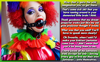


Nice cap, and Excellent idea Dee! I think you hit a very big step in getting the image size of the photo right. I can't count how many times I've seen the 'perfect' image, but it was just too small. I think that should be part of what you said... if it's too small, then you have to be ready to just not use it.
ReplyDeleteI think something else to add would be color. Whether it's a background color, or font color, I think it adds so much to the story. The colors can actually effect the mood of the cap. And it doesn't always have to be something from the image. For example, the cap you have here. You could have gone with a flesh tone, or brown from the image, but just by adding the purple border, you've made the purple text just pop!
He is gorgeous. Send huim my way.
ReplyDeleteMusy4pie@yahoo
@ Caitlyn
ReplyDeleteI've made mention of that in the past, but I will have to make a note about including it in a FAQ.
I'll probably go over many of the blog posts here and pull things I want to emphasize out and then make a FAQ from there, but I still want input from others!
Yeah, I see what you're meaning. I often use a wide-sized picture and put the text under the picture. I realize that the people then will have to scroll up and down.
ReplyDeleteI understand that putting the text in the image can solve that problem. However my caption use to be a bit wordy. So where should I put the text?
Font color is surely an issue when you put the text in the picture like you did here. You made a good job here, however I can imagine that it's more difficult if the background of the image varries much more from bright to dark, or not?
I wish something like that would happen to me
ReplyDelete