

Continuing the recent trend of Dee being a bitchy society woman .. this time, teaching someone a lesson!

Not that there isn't a lot of life's lessons to be learned here on my blog .. if you pay attention!
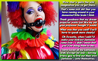
Here's a good example of why I don't usually write out stories before putting an image into a caption setting. I was at work and going through my Dee Mentia gmail account, and there's some Pinterest pictures that look very promising, including this one .. so I am not about to start making a caption at work, so I decide to whip up something quickly that I can edit / re-edit and refine when I'm home later, and I won't lose the impetus or plot line when I finally get back to the homestead. I hit compose and just start typing away.
A few things to keep in mind .. I usually make the captions 1200 pixels wide, and the font size is hopefully around 30 pt .. so that if I need to shrink it a bit to get all the text in, people won't have trouble reading it.
This is what I had when I got home ..
It used to freak BLANK out when those weirdo crossdressers and trans people used to come into her job, working at a high end shoe and accessory store in the factory outlets near her apartment."They come in here, trying on a bunch of shoes, stretch them out, and then leave after taking some selfies. How dare they try do that? I bet they even get off in their s!ssy panties, then head into the ladies room .. don't even get me started on that disgusting right they think they have! .. and then eat their bitter cum!"And so it happened one day that BLANK actually went off on one of those particular, and peculiar, customers that paraded around the boutique, strutting in front of the large mirror. I mean, HE looked really good, but my gaydar definitely tracked him as a pretender. I went to my co-worker and asked her to get rid of another of these lowlifes.10 minutes later, that person whipped out a platinum credit card with "Dee Mentia" emblazoned on it and bought 10k worth of shoes and handbags .. money that put a grand of commission into my co-workers wallet. As Ms Mentia walked by me, she grinned, and pointed two fingers at me and chuckled at my discomfort, one pair of her new purchase clicking against the floor as I steamed in anger.Then a cramp hit me .. hard. I knew it wasn't my time of the month, but I immediately headed to the bathroom, as it felt like my insides were all coming out of me. And they were! By the time I left the stall 5 minutes later, I'd grown a big cock! Probably the biggest one I'd even seen in person .. and way bigger than my soon-to-be ex boyfriend.
I KNEW even then that it was going to be quite a bit more than my usual captions, but it wasn't until I actually created the caption setting that I realized how futile it would be .. and that there'd be work to be done on both the content and the design of how the caption would go.
For those who want to learn more about editing and brevity, as well as proof reading, this would be a good example of it. I would argue that what I wrote in the email was fine the way it is .. even with the switch of 3rd person to 1st person. I needed to get down my idea as quickly as possible due to the conditions of my employment, etc ..
There are many changes of tense, chopping out words that didn't need to be there, and having a regular narrative structure capable of delivering the plot, but also highlighting a bit of the characters thoughts and motivations. A lot more editing that I usually do, as my usual process is to not write anything until I set up the caption setting of picture and background, only then do I type any words out.
I liked having her actual thoughts and realizations, but narratively it would be jumping around too much. I had to take the visceral 'punch' of her immediate reactions and mute it somewhat.
Evan after pruning and adjusting the text, when I shrunk it to fit the actual caption, it was way too small. I increased the size of the caption to 1400 pixels wide .. and it still made the font just slightly over 24 pt, which means the size dropped about 33 percent from it's original version.
This would have been a great candidate for a caption that was 2 panels, but I didn't have another image to work with .. and I wasn't about to hit my D'archives for an hour to try to shoehorn another photo into the story. Overall though, I'm still very happy with how it came out, and stretched my creativity a bit as I used a different work flow to make it.
What do you think about the caption before you read the posting that went with it? How has it changed since you read about it's creation? Feel free to answer those questions, or come up with your own in the Comment Section, which is awaiting your arrival .. so get there quickly!
Of course I was going to highlight a classic video from almost .. 20 years ago? YIKES!


On the cap front itself, I think you did a fine job. Nice photo selection, great accompanying story, and for me at least its completely legible.
ReplyDeleteOn the story editing front, I've done the same thing before when I've moved from 3rd to 1st person and back. It's annoying as in the moment it always makes sense, but later of course it needs major work. Otherwise, you tightened it up well. I didn't see anything in the original that I missed in the final version.
As for making it wider and having the text smaller... that's a constant fight for me. I'm fairly sure I accept a smaller font size than you do as your text still feels on the large side to me. But it begs the question, how do people consume these now a days? This is fine on my 4K monitor, but what is it at the far more common 1080? How about on a mobile device? How annoying is it when you have to pinch to zoom and pan to read it without seeing the accompanying photo?
End result... great cap Dee!
I totally get viewing it in different mediums. Jinny's captions mess me up a bit because they are usually formatted in a way that would read fairly well on a cell phone .. picture with text below, tall and thin where the aspect is more like 800 x 1400. Even on a monitor, I have to sort of scroll the caption.
DeleteA quick view of the operating systems that view my blog .. Windows is around 65 percent, and only 12 percent is on a cell phone (iPhone, Android) In fact, there are 3x as many MacOS users looking at my site than their are iPhone and iPad users.
The usual ratio in my head for a standard caption is 55-60 percent image, and the rest is the text field. So I lean towards 1200 pixels wide for the entire thing, and hence the image has to be 650-700 pixels wide.
With this image, I could have certainly cut out the left side of the composition, but it'd have made it a bit lopsided, having the model cut close to the edge and giving a lot of space to where the shoes are, which could have unbalanced it .. at least in my mind.
Glad you enjoyed it!
Wow the customer does look really good. Fair dues to them for the perfect lesson. Can just imagine Sarah after the initial shock wanting to get the most use out of the new equipment.
ReplyDeleteWe shall see if she continues to view them as freaks, considering she's now one of the people she fears. Gabba Gabba Hey!
DeleteWow Dee, you surprised me with that ending. But I loved it at the same time. I think this needs to be expanded on so we can see how it affects, changes Sarah.
ReplyDeleteRe font sizes, etc. I read these captions exclusively on my phone and my tired 62 year old eyes can still read your captions on my phone with little trouble. I do sometimes zoom in to study the image afterward but even then most of the time it’s fine as is.
I am glad that you can read it fine. I'm guessing you do a bit of pinch and expand to view them?
DeleteAnd it makes me happy to know that I sprung something upon you that you weren't expecting with the ending. I assume that most people are on the lookout for a patented Dee twist, sort of like a M. Night Shama Llama Ding Dong thing.
It'd be fun to see if Sarah stays adversarial or becomes an ally to the community.
I tap on the image to view it full width in my browser. Most of the time it’s fine this way. Sometimes I do pinch and expand, but that’s usually more often when I want to look at details in the image. Your captions are better on my phone than nearly any other ones I view so for me what you do works, and works well.
DeleteI am not usually one for the magic captions, but this was nice, a sweet revenge.
ReplyDeleteI hope she has to fight down an erection every time she waits on a special girl.
But we should not go stretching out shoes unless we plan to buy.
I like to think that our community would be asking to try on wide width shoes. When you get high end footwear, aren't they more likely to be more fitted to the customer? I honestly don't know because I tend to not spend more than 80-90 dollars for a pair of shoes.
DeleteBut yes, it's definitely great revenge for any of our sisters out there that have been given the side eye or harassed by a customer service rep.