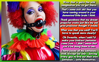
We shouldn't see everything in just black and white!
The picture was supplied by Terri in her "2 for 1 folder" and I told her she didn't have to give me 2 back since it literally took my 7 minutes to complete it from start to finish.
Definition according to Dictionary.com.
monochromatic: of, pertaining to, or having tones of one color in addition to the ground hue.
Many people think of Monochromatic as Black and White, hence the caption.
I like the caption because you don't see guys turned into women by complete morons very often. I mean, its usually a witch or a girlfriend with a vendetta, or the guy himself that makes a mistake when casting a spell. In this case, a bimbo noodlehead was trying to make him just like what he had called her, and of course she got it wrong. Another reason why I like it is that he seems to take in in stride, as it proves that she's clueless and he's still acting superior.Maybe he knows she isn't smart enough to reverse it?
DISCUSSION QUESTION: Anyone know of other TG stories and captions that have a plot similar to this one? I figured I would check out any that people suggest, as I'd like to see what others have come up with. Did anyone notice I have a disclaimer page as well as a preference page up top?


Here insistence that she does know big words seems to imply that she understands the meaning of monosyllabic and merely screwed up the spell casting it.
ReplyDeleteI'm going to go of on a tangent here and mention that the use of monosyllabic reminds me of one of my favorite games from the American version of Who's Line is it Anyway? I really love the game where they're each given a certain number of words that they have to use feet time they speak. I'm sure its in the British version too, but I've only seen the US show so I can't say for sure.
Now that that's out of the way, I don't recall a cap with a plot similar to this one. Also, I didn't notice your disclaimer page. But the page headers don't show up in the mobile version.
I didn't think about how it looked on a mobile device. I guess it doesn't show up there at all?
DeleteWell, the understanding that I had making it is that she heard what she said, and didn't know what it meant, but that it was insulting, so she tried to use the same word HE used, but it came out mangled. Sort of like a blonde bimbo saying that she wants to do makeovers so she is going to school to become a cosmonaut.
I can't recall any caps like this off of the top of my head, but I did enjoy it. I liked the difference in themes it provided.
ReplyDeleteAnd I did not notice the tabs before, but I do now. ^_6
Gorgeous image and creative cap! Great work Dee!
ReplyDelete-Elena Starz
Beautiful!
ReplyDelete