

This was just a fun little quickie that turned out way better than I expected, since I was winging it. I had no specific goal in mind, other than Tom was going to be a teacher. From there, I figured out that adults tend to judge their own generation as much more responsible and altruistic than those slackers growing up now. I wanted to see a pompous jerk get their comeuppance while being reminded that people have been shirking their responsibilities forever!
* SITE NEWS *
We are probably 5-6 days away from hitting 300k pages viewed. I probably would've hit that by now, but blogger's counter went down for about 3-5 days and we got no credit for any page hits then. We are almost at 100 followers as well. I am hoping to hit that by the beginning of May.
I also have a few captions that will be blog exclusives coming soon. Nothing spectacular, but I had a few ideas that were more generic and didn't quite fit anyone, but I still wanted to create.
Things will slow down in real life within the next few weeks, so I will try to get "Jennifer's Challenge" underway. I need to go back and find out exactly what the hell I am supposed to be writing for it again LOL
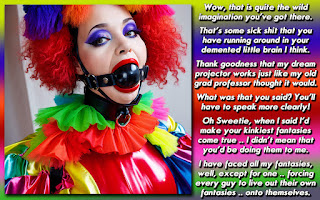
DISCUSSION QUESTION: Are the gradients distracting to you? What is your favorite part in the captions that I make? Overall style, the story lines, the wit, the marriage of the pictures and story? Any particular things you don't care for as much?


First off, great cap. Works wonderfully with that picture, and I think the gradient really gives it that extra patriotic punch.
ReplyDeleteCongrats on the page views! But I'll be honest... I'm not sure how much I trust Blogger's page views. I believe (I never actually wrote the numbers down) that I've seen my own 'Pageviews all time history' go down before. I could be wrong, and I have no evidence to present... but I still find it hinky. Now I know that Google uses a different criteria for pageviews (I started using Google about a month after I started the blog, but it shows a good 60% more pageviews), but it shows a pretty good trend between page views and visitors.
Plus since that outage (I was really wondering why I only had 12 pagviews in 3 days!) I have lost the ability to look at pages viewed. Ever since the outage the 'Posts' tool thingie lists "No stats yet, check back later."
As to the gradients, I think they work most of the time. I say most because I do have one fault with this last one... white text on the white area of the gradient is a little harder to read. Now thats not to say its impossible to read, but the speed at which I can read it is slower.... so the story seems to slow down in that area. I've found that either staying wtih two fairly light colros for the gradient (and then using a dark color for the text) or two fairly dark colors for the gradient (and hten using a light color for the text) avoids that problem.
I don't know that there is any particular thing that I don't care for in your caps. I mean sure... some of the stories don't work for me, but its generaly because the subject matter is out of my preferences. I still enjoy the writing, and appreciate their creativness. They just wouldn't make a list of my favorite caps. As to what is my favorite part, I would have to say 'The Wit'. I associate that with the tone of your writing and the way that you can slide something inapropriate into a cap, and make it work (like a joke into a dark cap).
I think the gradiant works and I admire your ability to mix colors that go together provide just the right accents and appeal to the eye. Even though I typically gravitate to more hardcore caps I LOVE your caps and I think it is the whole package the mix of clever fluid interesting writing, creativity on the stories and your ability to select AWESOME pics that just WORK for the spirit of the cap you are trying to capture. Many cappers (Myself included) seem to settle into a theme or style as far as storylines that make them predictable or like chocolate.... they are good when you are in the mood for chocolate but if you want variety or something different that day they won't cut it. You seem to constantly be able to come from different angles of interest and totally unrelated story lines and themes which when coupled with your artistic flare .... keeps me coming back for more.....
ReplyDeleteWhat don't I like? Nothing in particular stands out to be honest like Caitlyn said some don't work for me like others but that is true of all artists and cappers....
Davewashere25
@ Dave
ReplyDeleteSo.. Sometimes you feel like a nut. And sometimes you don't? *giggle*
@ Dee
The gradient work looks good to me. But now that caitlyn mentions it, white text on a white background is a little blinding.
I guess if I had to pick out one thing I enjoy of your caps, it would be the wit.
I think you nailed in this one Dee, there are some issues with people catching on colours, but i think that depend on who's watching it, i don't find any troubles at reading this cap, but i think adding a darker shadow to words could work in here.
ReplyDeleteI personally choose your stories because they are well written, they have a deep plot and that's what i want when i read a cap, some shorts caps with funny themes are good too, but i prefer well thought stories...
Hugs and Kisses Alectra
P.I: Dee you didn't commented or say anything to me about that story i made for you as a freebie in my blog, i'm still waiting it :3
@ everyone
ReplyDeleteI will have to think about the white gradient part of this caption ... my monitor at home is very sensitive, and I didn't have much problem at all with the white balance. Its another reason why I tend to use shadowed text, since it will show better on light backgrounds. When I look at the caption here at work, I can see what you are talking about. I'm betting that it doesn't look very good on a laptop. I'll have to factor that in going forward.