

It was certainly me which is why I MADE this caption. Wish fulfillment at its best!
Not much to say here. I wasn't going to post anything, but was zooming around online and saw this picture. I cleaned it up for future use, but then a thought bounced around my head and I found myself making a caption right then and there.
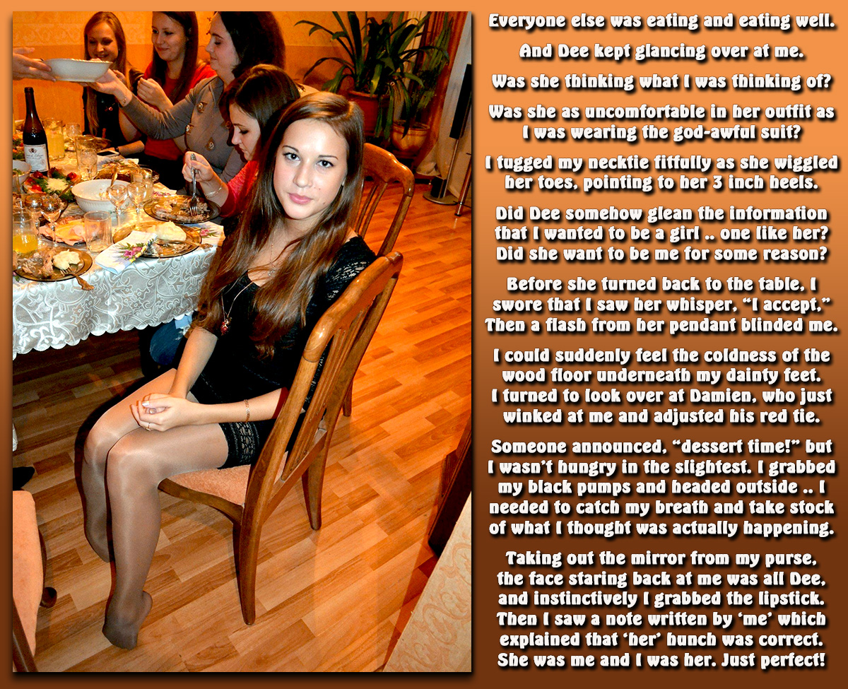
I can remember feeling like this many times during extended holiday family gatherings. At Easter, there would be at least a few girls running around in fancy dresses with mary janes and white tights all the way up through my teen years, while I'd look disheveled in a suit jacket and clip on bow-tie. By the end of the day, they'd usually have grass stains on their outfits and ripped nylons, and I would be like, "Hmmm, they'd be much more comfortable in what I am wearing I think, and boys are always allowed to be messy! If only the Easter bunny had swapped our genders instead of bringing stupid eggs for us to find!" I was always into hose and tights, even as a kid.
So this is technically the "Damien is probably at someone's extended family graduation party" version of that fantasy. You don't know the other person that well, but you've met them enough times. And hey, if there is magic to make it happen, there is certainly magic that will have you acting enough like the new you until you can get your own bearings and make this new life your own.
Wow! I wrote longer than I thought I would! What do you think of the new font I've been using? Feel free to write about the caption as well since it's a blog exclusive. Was it something you felt too as a young person, or did it come out more when you started adulting for real?


That touches a nerve, in a good way, and I get the sentiment. I never had anyone I looked to in that way, but I suspect that, if I had, I would have been even more invested in your caption. I'd like to say more, but I suspect I'm just babbling.
ReplyDeleteNot sure I'm a fan of the new font, but I am a bit odd and like Rockwell and Arial Narrow, so I'm not the best person to be asking. Showcard Gothic is nice, but hardly appropriate. In short, I bow to your greater knowledge and instincts with fonts!
Joanna
Feel free to babble on any of my captions. Glad to see you still floating around the TG sites. Many people seemed to disappear at the end of Jan through March and most havent' returned yet.
DeleteShowcard Gothic is more slanty towards the middle of the letter on both sides so I would only use it in a title. I liked this one because it kerns pretty well yet has some decent curve to it, plus it doesn't eat up as much space as some other bubbly fonts. I think in the future I am going to get more definite about which fonts go where, like as you mentioned, this font seems to work better projected ONTO a picture, as opposed to in a text column like this one.
In my everyday life as an office manager/worker, I tend to use Tahoma an awful lot!
Ah, Tahoma! Always good for instructions!
DeleteAnd yes, still drifting about, been a bit mad trying to prepare for and deal with a newborn! Will hopefully maintain activity more now.