

We've got a good number of contributions this month considering the early deadline!

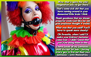
Well, first up is one I made a few minutes ago, right before snagging all the other submissions for this month's DIY Challenge. I haven't read anyone else's yet so I could approach it in a fresh way without having some guidelines placed upon it by someone else. While it is a great picture, with lots of scenery and elements to it, this wasn't the easiest photo to work with, and I am glad that we had many people up to the task of captioning it!

Next up is Ian, who I think might have been the first to submit a caption for this challenge.

Helena is back with another go round with the DIY caption centered on delicious escapism.

Brittany works a tale of revenge and the promise of a new life for two people.

Apparently I didn't put Dawn in here originally! She certainly made it in under the deadline! That's what I get by trying to be efficient and do this blog at work!

Newcomer to the DIY Challenge, Brooke chooses an escape with real-world implications!
Great job everyone! See you on Sunday!
Yeah, I've been on a Weezer kick lately!


Great D I Y s and its good to see such a turnout and a good caption from Brooke.
ReplyDeleteI agree. Hope she'll pop back in for next month's DIY challenge too!
DeleteIndeed, all great DIYs.
ReplyDeleteIt seems that our approach to the DIYs are different, Dee. I like to read the other entries before I start on mine. If I see some ideas that are similar to the one I have, I can try to go in a different direction. However it is rare I feel the need to go a another way with it.
I can understand that thinking. i'd just prefer not to even go near someone else's story if I can help it, hence why I don't bother reading beforehand.
DeleteWhile I enjoyed all the caps I have to say the dark type was very hard to read on Dee's cap and the font on Ian's made it very hard to read - maybe a little less arty and more legible? Hollow type is hard to read in a smaller type size. Only the caps stood out like the beautiful letters that often began pages in the bible or old fairy tales. Then again maybe it's just my eyes. On my Kindle I can easily enlarge the type but on the PC I have to use the magnifier.
ReplyDeleteI think you meant Helena's with the hollow type .. which is the one with the yellow background. Also, I used light blue and white type for mine, so perhaps Ian's was the one you meant with dark type? Ian used white, black and red on his.
DeleteI had to blow up Helena's as well. Even though I have a tablet, I should think more about how people read the captions, as I tend to create them, and read others, on a 1920 x 1090 24 inch screen. Something to ponder.
I am experimenting a bit with font and design. Here it was mainly the font. I always try to let readability prevail, but as I didn't have problems reading it myself, I guess I goofed up here. When I read my caps back I should keep in mind that I already know what it says, so thank you Dawn and Dee for pointing this out. Constructive critisism like this will hopefully help to become better.
DeleteYou're right I misidentified the caps. I have a 19 inch screen and I know I usually make my caps too wide 1400 pkus) for those with standard PC screens though my Kindle sizes them to fit in lamdscape and I can read them. without blowing them up.Perhaps because I won't drop below 12p for the type. I usually start at 18 and reduce the size if the the story won't fit (or in rare cass bump it up. Probably 90 percent of my caps used to be in 12p but I think I've cut that percentage down considerably abd also tried to make the cap marrower if I can without dropping the type size down. I also often start out with a larger typeface in bold and unbold and use a smaller type face to try and not reduce the size.
DeleteI really enjoyed all of the captions, but what I liked best was seeing all the different ideas of what was going on in the photo - it's neat what our brains do sometimes. Thanks for letting me contribute. Great job everyone!
ReplyDelete