

As long as Snooki stays as far away from us as possible!

Found this picture while hunting for photos to match the stories I had written up on Saturday, and came across this one. It looked like an old postcard, even though I'm sure its fairly new. It also reminded me of Steffie, who has been gone for quite some time now from the Haven. I often get to missing those who aren't there anymore, so I wanted to whip something up to honor her work. She does pop in from time to time there, so I am sure she'll see it at some point.
This turned out to be much more detailed and time consuming than most captions I make. I knew that with the story I had in mind, I needed TWO postcards, the front of the first one containing the picture of Steffie, and a 2nd one to follow up so that the reader could figure out what exactly was going on.
The tag line came first, and its something that would've been put on an old humorous postcard, so I tried to use a cheesy basic font. No font shadows, kerning or sharpening the letters. What I typed is what came out.

Once I knew that it was good enough, I saved it as its own JPG, figuring I can stack/layer each piece of the caption when I was all done.
After that, I needed the backside of a postcard so that I could write a note from Dee, and try to flesh out enough of a story to convey what I wanted. I snagged a template from the internet and laid down the body of the note on the left side .. then saw that I needed a cancelled postmark and stamp to show that it had actually been sent. Found something decent from a Google search and layered it onto the template, then blended and merged it with the template.

I made note to make both the front and back sides of the post cards the same size, and they are close to the true dimensions. I also filled EVERYTHING in .. as its the little details that make all the difference .. plus I wasn't sure how everything was going to be laid out on the table for the final version of the caption.
Once I had it the way I wanted it, I created a framework that I could put all my elements into. I didn't want any sort of additional background story or exposition. I figured that a table would be a good way layout, so I snagged a traditional tablecloth setting. Looking back, I probably should've rotated it a touch, as its all too grid-like. Hmm, actually since I'm doing this as more of a caption "tutorial" I am going to go back and fix it now .. and do a bit more color correction. You can see the 'final' version down below so as not to wreck the flow of this piece.
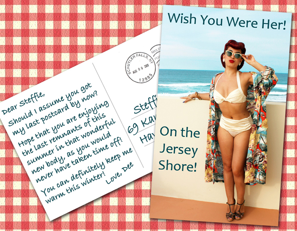
It took be a bit of time to figure out how to get both in the framework without losing any sort of information I wanted people to see. Both cards have shadows indicating depth of being on top of each other which is as feature I cannot do without!
I did take a few little shortcuts but nothing I felt really bad about. I could've randomized the handwritten font a little so that it wasn't so neat. Its all a bit too sterile, but I would rather have it be legible than authentic. Don't you agree?
After that, I knew I wasn't done quite yet, as there was too much "dead space" where nothing was going on. Since Steffie is a refined young woman, she probably has a good amount of money obtained from so many of her appreciative friends. I figured maybe she was ordering some take out food, and if for some unexplained reason she was unable to charm the food out of the delivery person, she had some money to pay for her meal. So here is the final run through with the color correction, etc ..

Now, that is something I'm proud to have made for Steffie. Really hope she likes it!
One of my favorite songs by The Cure, and such a great sounding live version.


Very nice caption, Dee. It's tasteful, it's touching, and it's beautifully laid out. It's something any of us would be proud to call our own, and I'm sure Steffie will love it.
ReplyDeleteAmanda
Steffie did reply!
DeleteOh gee, I only wish I got some time at the shore this summer. It's been a tough couple of months. Thanks for the warm thoughts and the beautiful caption Dee. Hope to see you around soon.
Hugs and kisses, Steffie
I am glad you liked it Amanda. I am still digging it, and the extra changes I did here on the blog made it better. I hope it shows people that sometimes it pays to hold off a bit and look at your work with critical eyes even BEFORE you post something! Its just that enthusiasm is contagious and you REALLY want to see what people think about your work so we RUSH RUSH RUSH to post!
"...hold off a bit and look at your work with critical eyes even BEFORE you post..."
DeleteI could not agree more with this statement. I've been doing this forever. Way too many captions (and even stories) are rushed into publication. It's not just typos and other mistakes aren't caught; word choice and formatting suffer as well.
Let Dee be an example to all!
Great cap Dee! Your attention to detail really makes this pop. At first glance it's simple cap but your extra work is what pulled off that effect. It really pulls the reader in. And I love your final touch of twisting the 'tablecloth' and saturating the color a bit... it gives it a more real feel. Wonderful tutorial!
ReplyDeleteIt grew organically and I really wanted to show how I went about the thought process from start to finish since this took more planning that I usually do .. all because I wanted it to look simple and real life!
DeleteThe creativity in this caption is simply awesome! And as a resident of the Jersey Shore, this postcard gave me extra reason to smile!
ReplyDeleteCiao! Elise
Thanks for the comment. I had written a bitchy blog post around 4 PM today to post tonight about how this is hardly getting any page views .. I came back and you left this really sweet comment! I might have to rethink my posting now! LOL
DeleteI'm a big fan of gingham anyway, so the 'dead space' here was actually less dead for me.
ReplyDeleteCleverly done, as ever, and I like the colourful nature of it.
Now, to catch up with the rest of your output...