

Calvin isn't married .. yet! But you just never know! And neither does he!

Well, this could be for anyone, and I left it so that anyone could picture themselves in that position, but I just loved the idea, and the zinger at the end. It's something that Calvin / Caitlyn worries about often when she's making captions. She's so thoughtful, and really labors hard to make every last detail in her work as perfect as it can be. Something we can aspire to.
And I'm sure that all of us captioners have been there before. You see a great photo, and a great idea to go with it, but there's something that just doesn't work .. and takes you out of the plot. It could be an easy fix, like 'shop'ping out a cigarette in her hand, or cropping out another person or pet, but many times, it's not something as easily fixed, like watermarks over body parts, the wrong expressions on their faces for the mood you are going for, or rugs, wallpaper, ugly couches, or worst for me .. horrible choices of footwear! Really now. These porn stars have plenty of costumes and lingerie, but only 3 pairs of heels? You are DOING IT WRONG!
Sorry! Got side-tracked. But anyway, things can throw you a bit off. I have actually 'shop'ped electricity wall outlets out of the frame because it's a British model's picture, and my story is implicitly USA or vice versa.
So, one that note, I thought it would be interesting to turn a caption story on its ear a bit by having the "twist" be that she's not really shocked or questioning what is happening (and I am not sure of the backstory at all, just that she caught him there) but that it "just doesn't look right" from the artist's perspective. And that she doesn't seem to mind him dressed up looking like that. My job is to subvert people's expectations now and again, and this is a wink and a nod to doing that, without going completely meta with it. The caption itself is enjoyable without it, and I do hope that everyone takes the playfulness and acceptance implied, but does get a chuckle from the side story I added into it.
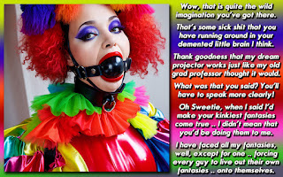
Design elements here to discuss. Text shadows don't work well in this caption because the backgrounds I could use are mostly white. It's why I left the photo tint the way I did, instead of color correcting the image. (Actually I just fixed it with a few other techniques that didn't wash out the lines as badly as I thought they would.) I wanted the dialog to be as readable as possible, so it's just the font with nothing added, other than being bolded to stand out. I also blended some of the tile so that the text wouldn't clash with the lines, and I am pretty sure I removed something else. Lastly, I hope that the way the dialog is set up looks pleasant enough with how I wrapped it around the image composition. In a way that it looks like it should be there.
Still have some days left to get in on the writing exercises as mentioned in the last few posts. So far, I only have one submitted and one person that said they'd give it a shot. People have asked me to start up the DIY Challenges again, and this is a dry run of that, so let's get hopping!
And I made it all the way to the end of the post without making a Lebowski line. This aggression will not stand, man! Honestly though, the rug certainly did NOT tie the caption together!


Lol, gotta have aesthetic appeal... even in bondage!!!
ReplyDeleteYour look should never be retrained when it comes to restraints!
DeleteMy wife has much better taste than I do and has corrected my choices more times than I could count! I defer to her in all things regarding wardrobe....however while she dresses in a "sexy but conservative" way....most of the time she prefers me in a "slutty, slutty, slut" style!
ReplyDeleteSometimes I like it but sometimes I'd like a more "June Cleaver" kind of look....
But I understand the scenario in this cap in a very personal way!!!
That said....I'm following your tutorials....they're interesting even for me although I don't really do caps like you do so nicely...
And that's what this one was....a nicely done cap!!!
Kisses
Kaaren
My best friend, when she has a day off from work, will rock the "heels and pearls" as we call it, awaiting her boyfriend in the June Cleaver look .. and usually cooks a meatloaf or chicken casserole.
DeleteI am the stylish one in my household. My daughter prefers me to go shopping for clothing with her, including bras. My girlfriend's style is strictly Lesbian Lumberjack and I've definitely worn more heels and skirts that she has even done. So I tend to shop for most of her clothes as well! The irony is that I look horrible in anything that would be considered fashionable or trendy. I tend to get by looking my best in jeans, boots and T-shirts and hoodies.
And well, you never know. You could shock us one day by making a caption! At the very least, you get an understanding of the reasons that I make the "artistic" choices in specific cases.
Appearances matter, and sometimes we're so lost in the fantasy that we need that outside perspective. Plus, I like being told what to do and how to look, so I'm 100% on board with her advice. :)
ReplyDeleteThought you would find this caption amusing. I did notice that his wife had no issues with his clothing choice. You can't really go wrong with a black skirt and heels! Truly timeless!
DeleteHA! Now I’m feeling more like the wife in this cap. “Hmm… you’ve made yourself pretty but forgot about the background. Come on sweety, let’s get you off the floor and bent over the chair properly!” Love the cap Dee, and love that you thought of me!
ReplyDeleteI obviously resemble this caption as yes, I many times let the details get in the way of enjoying making a cap. For instance, when I viewed this on my phone last night I had to zoom in to read it, but didn’t want to cap until I could see it in it’s full glory. Now that I look at it this morning… I can’t stop seeing her as sticking her fingers in the socket. ☹ The shadow shows me that’s not happening, but not I can’t get my eyes to stop seeing it! It’s…. waitforit… shocking!
But seriously, I now spend more time trying to find an image that both inspires a story AND looks good from the get. I’ve spent too many frustrated hours with a ‘kinda good’ photo writing up what turns out to be a really good story and then spending hours editing and changing the photo or looking for a new one that could work better. Nowadays I just look at those photos, take a moment to smile at the story idea that comes up, then move on and hopefully use that creative energy later with a better photo to start from.
I like the design elements you’ve discussed. There are so many variations we can use with text that sometimes that ends up being half the battle! I didn’t notice the blending you did with the tile on the first read, but that just means you did a great job of it. Looking at it again with the knowledge of what you did, I can see it, but it still works beautifully! Great job!
And yes… I did wonder when the Lebowski line was going to come!
And hey, sorry for not commenting on this earlier! I swear, I remember stopping by and seeing the MMA cap, the stopping by and seeing the Bigfoot one…but I somehow just skipped over this and didn’t see it. My bad!
I figure you were busy during the week, and I had posted quite a few posts since then, which is why I gave you a message yesterday so you wouldn't miss it.
DeleteI know captions are a bit different for you because you tend to look through sets, and gleam your plot that way. I tend to want ONE picture, as sets overwhelm me with, "which one am I going to use? All of them!" and that won't work with my brain. I tend to, as Monty Python would say, "Just get on with it!" unless there is something glaringly wrong with some detail in the photo.
I most likely would have ignored this image, except I only had that quick bit of dialog in mind due to the design clashes, and wanted to do a somewhat expanded version of a Ann Michelle caption, and for that, I think I succeeded.