And perhaps the morning that the McCree Sisters will never forget!
One of the things I don't really like to do is make the recipient of a caption an asshole unless they specifically say they don't mind. However, in this scenario, I wrote it so that Amanda could imagine that she was whichever brother she wanted. The younger one seems to show a bit of remorse, and perhaps just went along with the big brother because .. well, that is what big brothers do sometimes. They aren't always a good influence on their siblings, and the younger ones could be just along for the ride, getting attention in any way they can.
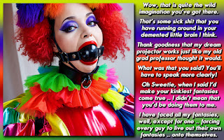
I also tried something a bit different in design, where I set up the text around the picture, instead of just to the left or right. I didn't want to make it any smaller, and there wasn't much height to it either, so I thought I would go with something different. Luckily I think it worked out REALLY well.
It also helped that as I was composing the design, I thought it'd be best to set up the scenario with narration .. once again, something I don't often do; it's either all conversation, or mostly story exposition with perhaps a few lines of dialog. And then, I would end it right where the picture was taking place with dialog to close out the entire caption. I had it marked up in my head, and I think it was the right choice.
So, what thinks you, the readers? How'd I do with something a bit different in design? Did everything work for you, or did something fall short? Which brother would you have been? If there was another panel to this caption, what would happen next?


The design works great for me. I think it flows really well.
ReplyDeleteThe McCree brothers sounds like a couple of cowboys to me. I could see the McCree Sisters being bandits or bank robbers at the very least. They would probably have to wear outfits that brought a little less attention to themselves though ;)
I know it sounds invented by me for the purpose of the caption, but that's her last name as far as the Haven is concerned!
DeleteThats one thing I enjoy about your work. Your always tweaking and adjusting and fitting everything to the picture instead of just cookie cutter works.
ReplyDeleteI thought it worked well and Id definitely be the little "sister"
Thank you for the compliment! I try to make everything fit together the best way it can, so to me, the design is just as important as the story and the image I'm using.
DeleteThere are so many little things that can take a caption from average to stunning, without that much effort on the part of the captioner. They just have to recognize where to cut and where to focus.
Hi Dee....I liked the wrap around design and it allowed for a little more space to spin your tale!!!!
ReplyDeleteAll I could think of was wait till Mother McCree gets a hold of those boys....girls now....wait a second though perhaps it was old Mother McCree that brought her boys to the salon in the first place....I foresee a lot of punishment and training in those "girls"future!!!!
I liked it and I think it could really be easily expanded upon!!!
Kisses
Kaaren
It could have completely been a set-up. I hadn't thought about that option, but that could certainly be the case! I mean, I guess their cell phones weren't going off all night while they were being programmed and dolled up.
DeleteAnd once again, McCree is a quality last name for stories and captions!
OMG, you totally had me at matching collar! Fun caption with a nice transition there at the end. Painted nails are kind of an anchor and a trigger, aren't they?
ReplyDelete