

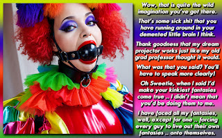
A caption I wouldn't normally do ... done!
Back last July, Steffimarie had offered a picture on her blog (she's now Britney Shagwell, see the link in the column to your left!) and wanted to see what others would do with it in a caption. Quite a few people took a shot, and I wanted to stretch my captioning muscles a bit. In fact, I didn't want anyone to KNOW that I created it unless you saw something that said I created it. If you aren't interested in how the sausage is made so to speak, skip down towards the end for the completed caption, all ready for you to gaze upon its TG goodness!
First, she supplied the picture. I am trying to find the original but it doesn't seem to be on her blog anymore, and I apparently never saved it to my hard drive. Anyway, I extracted the background from the photo of the girl, so that I could place it on its own background. It wasn't anything I wanted to keep as I wanted to be focused on her look and appear to be mesmerized, since that was my storyline plot. The picture edges are a bit rough, but they'll blend in nicely with the background, once I decide what I wanted to use.

Since she has red hair, I wanted the background to stand out on its own, so I went searching for something orange and swirly. This one did the trick nicely and would provide a nice contrast for the white lettering I was going to use.

It was a bit too clear though for my tastes, so I copied the original, rotated it, then copied it again. I then changed the opacity on each level. I tried to line up the swirls to somewhat touch and also overlap until the background was the right balance. Yes they don't cover the entire field, but the picture will go over most of the space that isn't duplicated

Once we put the picture into the background, you'll see how it all comes together. The next thing was I wanted to have some vibrant text that would serve as both the title AND the initial (and most crucial) quote. I barely ever do this, and I thought that it would be fun to be more like Caitlyn, Steffi, or even Simone. I thought that a kinetic styled design would work best, so I took each word and bent it using the Warp Text tool from Photoshop. Each word is a separate layer so that I could have more control over how they would bend. After I was happy with how they were positioned, I added a shadow effect to the words and duplicated the layer to make it stand out more.

The next step at the time was to flesh out the actual story line. At first, I wanted to make sure that I used a different font, once again to cover the whole "this ISN'T Dee that made this" vibe I was looking to convey. I wanted something clean that would be clearly legible against the admittedly loud background. I actually went through about 30-40 fonts before I found one I liked .. Tunga.
From there, it was just the point of writing down what was in my head and tightening it up on the fly. I edit myself RIGHT inside Photoshop. That way I don't have to worry about killing entire paragraphs if I don't have enough space. Many times I've simplified the plot once I realize I don't have nearly enough space to pull off what is in my head. Perhaps that is a big reason why my stories often seem to be "a moment in time" rather than an all encompassing story arc. Anyway, I had the basic formula in my head, which ended with a "Body Snatchers" twist of "JOIN ME!" as the zinger that made the entire caption come together like Lebowski's rug. Once again, the text is placed inside, shadowed, and layers duplicated to make it pop out from the background.

Once I got to "the end" I put it aside for at least a few hours. I figured, why submit it when the deadline hasn't quite hit yet? Better to look at it with fresh eyes and see if I can improve in any areas. After thinking about it, why would any friend just sit there and stare at his friend that had been dressed up like a girl and was acting like one too?!? You'd question him after trying to get the girls to leave Ron alone, and probably try to snap him out of his fog. I fleshed out the questions kinetic style which I think does a great job of summing up what had happened before the caption technically kicks in. You see the large text and the picture and you already have half of the plot right there for you without the need for major exposition. That leaves us with the finished caption.

So, why don't I make captions like these all the time? Good question! Well, truthfully, its a hell of a lot of work, as someone like Caitlyn, Steffie, or Steffi would tell you. In my opinion, people read my captions because they are quirky and have a different sort of perspective than most of your typical captioners. They aren't coming for the presentation so much, even though I do try to make them look much better than the "black text on white background" style that was considered normal for many years in the TG captioning scene. Now that I do picture tilts and background gradients, it takes me about 15 minutes per caption, which is up from when I could grind them out in about 6-10 minutes previously .. which isn't too bad since they look SOOO much more presentable now.
However, when I spend more than an hour on one caption, like this one, I lose steam extremely quickly due to my Adult ADHD or whatever it is I have. Both the effort and the story will simply vanish into thin air. Sometimes its a race to see if I can get out what I want to say before its gone. If I am in a position to write something down, either on Evernote on my cellphone or tablet, or email myself the idea, I have half a shot of making a caption, but even then, I'll be sitting there later reading it, saying, "what exactly did I want to do with that again?" I can sometimes cobble it together, but I'm sure its never as good as when the EUREKA moment initially hit.
Anyway, I am quite proud of what I made, even though it didn't win. I thought I did a great job of disguising most of the creative elements of the caption, other than the story which does seem a bit Dee-ish if I do say so myself. Perhaps I'll become inspired at some point and whip something up a bit more ambitious design wise.
DISCUSSION QUESTION: I didn't want to get too technical about what I did with regards to the construction of the caption. If people have questions about how I did things like shadows, etc .. I wouldn't mind though it might be a bit harder to do in blog format. Any questions in relation to the procedure or anything else in the production of this caption? Do you think I succeeded in making a caption that you wouldn't have recognized as being done by me?


I agree that you managed to give it a feel as though done by someone other than you Dee. But your artistic touch cannot be denied. Great work!
ReplyDeleteKisses,
Leeanne
An image cropped out of the photo and added to a different background, text wrapped around the image instead of put in a box to one side, two DIFFERENT fonts!? All these things seem to scream that "Dee did not make this", but looking at it, all I can think is "Ooh, another neat cap from Dee" ^_^
ReplyDeleteI really like how the white text plays off the swirly background in an almost hypnotic fashion ^_^
I guess its hard to fool some people, huh?
DeleteThat or I've done so many captions that people have a really good idea of what exactly a "Dee Caption" feels like.
Great!!! Love the ending!
ReplyDeleteThis is most certainly NOT a Dee cap. This is absolutely a Dee cap. It isn't a Dee cap. It IS a deep cap. Isn't. Is. No. Yes.
ReplyDeleteI'd have to say that it is both at the same time. There is no denying the feel of the story is as Deelightful as any other Dee cap. And while the layout isn't a standard Dee style, it still rings true as one. It's like a Dee cap from a nearby universe. One where Jennifer loves anal more than oral and where Leeanne is a mistress making sissy slaves out of everybody!
I'd love to see you explore more design wise. But only if it doesn't disrupt your regular rhythm.
Hahaha, Leeanne being a mistress! Good one!
DeleteI think about doing that from time to time, but only occasionally do I actually put that much effort into it, like the stacked pictures or something like this.
I think it works better on captions with a substantive plot and verbiage, neither of which I do much of in this medium. I don't often pin down exactly what happens, and let the reader's mind wander to color in what exactly is going on. All that is in the text box, and sometimes I wonder if I'll overwhelm the reader if I make it into a pretty package .. somehow they won't take that step from my words to their imagination if I'm giving them a distracting container.
Not sure if that makes sense, but it is a bit of a concern.
Seeing this great caption on your blog, I see your hand in it, But if I would have seen it anywhere else, without proper credit to you, I don't think I would see it.
ReplyDeleteSo I would say, you did succeed in making a caption that is not recognizable as yours, unless you know it is.
I'm definitely interested in how you make shadows, bend the text, outline it etc. However, I don't know how much it matters I use GIMP, not Photoshop.
There should be tutorials on how to do things in GIMP. Many of the tools I use in Photoshop are built into the program so I'm not sure if they have an equivalent in GIMP. I'm using version CS1 so I'm a bit handicapped there against other captioners that have the latest versions.
DeleteI might do a standard breakdown of how I make the usual captions you see almost daily here on this blog. A lot less elaborate and usually take me about 10-15 minutes each.