

This all came about because of a commercial on Sports Radio I heard the other day.

I kept it fresh in my mind, and I developed it when I got home from work.
This was one of those captions that I KNEW would not be a standard text-on-the-side designs before I even started, so I was sure to make sure I had enough space to write what needed to be said. And as I was writing out the story, I determined that having the picture in the lower left spot would be the best placement. That way, all the set-up could be done above, and then put the topper/zinger right next to the photo, where it would make the most sense, and also give everything the most impact, while tying it all together. Hope you'll agree.
And this is something I'd like to bring up. I am not sure about other captioners, but I do spend thought on just how each caption is going to be designed, how it will flow, and how best to tie everything together. Things like "which way the model(s) is/are looking, their focal point," "how am I going to show each person speaking" and "which colors will I be using to tie the backgrounds and test into the whole package". I am betting that many of the other captioners you follow will put at least a perfunctory ponderance towards things like this as well.
I like to think that the days of using Microsoft Paint and back text on white background are way behind us now here in 2022. There's tutorials and all sorts of graphics programs out there now to make presentable captions. But everyone has to start somewhere! Or if you've already done some, figure out ways to improve and refine your style to the point where it's recognizable.
So, I'd like to have a discussion / ask me anything that deals with the creation of captions. Feel free to post your questions down below about anything you'd like to know about: story creation, caption building, fonts and colors, proofing, methodology .. it's all on the table! And I invite other captioners / fiction writers as well to chip in and respond.


Very clever trap! And I mean it both ways! I think Ashlee is really stuck now!
ReplyDeleteStuck, but she's definitely got a future online. Getting sponsors can really add up!
DeleteGlad you liked it!
That script was fun, but I think the truth of the caption comes early on with "Like totally for real" and "I'm starting to act like girly all the time." There's no brother there anymore, just a sister waiting to break free and give into that protein stick craving. :)
ReplyDeleteGlad you were so perceptive in catching that. Definitely wanted to set that up .. and of course Dee just needed to push that forward with the new sponsor!
DeleteAnd honestly, the first sentence in the commercial I heard was something like, "There's nothing better than the creamy nut butter ..." and I wasn't quite paying attention, so "CREAMY NUT BUTTER" just seemed to pop up out of the blue! I just HAD to do something with that.
After that zinger of a script the followers are going to skyrocket and no chance of dropping Ashlee now.
ReplyDeleteMaybe she'll get to find out how good a small batch of nut butter is from Damien's sack. And yes, I'd definitely watch a video of a girl being embarrassed by a script like that, even though it'd probably be even better if she leaned into it!
Deletemake a note - reduce the font size on the TelePrompTer next time part way thru so Ashlee leans closer without realizing....
DeleteI have a question: do you take colours from the image that you use (so matching background and text with colours drawn from the image) or do you go with a more 'arty' approach of just using your eye until you are satisfied?
ReplyDeleteSecondly, when choosing font, do you find that you have a go-to or is it based on the type of caption and mood of the piece?
OK, we got questions!!!!
DeleteThe first one is that I tend to take colors from the image, at least in background. If I have 2 people talking in the caption, and they are both in the picture, I also try to "match" their shirt color, or hair, or something that can give a subtle hint as to which person is talking.
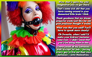
So in this caption, the text field colors are drawn from her walls, which I create a gradient between from darker to light. The text itself, I use her responses in text format with a color that is drawn from the hue of her hair. I usually try to keep someone speaking in white, as it has the best contrast against any sort of background.
In general, I tend not to make any backgrounds too white/bright, and I tend not to make any text colors too dark, so that they are hard to read, especially since I also tend to use shading and shadows for texture.
For the 2nd question, I have a few different fonts that are my favorites, and those usually are ones that people can recognize when they see a 'Dee' caption, even if it's more of a subtle clue. I can/will flip-flop between them, but unless I'm doing something that is from sort of based on physical media, like a newspaper or handwriting in a diary .. I will use one of those fonts. Trust me, I've tried HUNDREDS or fonts, and the ones I chose, I feel those look the best with my design esthetic, they kern well, adjust size either in a larger size or condensed, and give me enough room to tell my story in the space I've provided for myself.