

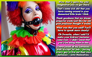
My House .. My rules .. My God! .. My body!
This caption topic is my general theme for today .. changing up (hopefully for the better) things around you. In this one, Patrick soon finds out that you really shouldn't set a precedent you can't follow up with, especially when your offspring has magical powers. Even in real life, if there is a loophole somewhere in your reasoning, your teen daughter will find it, trust me!
This is what I said in a reply to a comment posted in the folder when this caption was originally posted to Rachel's Haven:
The loophole was sorta thought about after watching 10 Things I Hate About You" with my own dear sweet lawyer, well, until the phone call came along that she had to take "CUZ, OMIGODYOUAREKIDDING? WHATHAPPENEDYOUTELLMEEVERYTHINGHONEY! ITWILLBEOKISWEAR!"
Yup, she'll be an incredible Penny Mason in a few years!Its an old caption, but I think its a good plot device, and one I hadn't seen much of since I made it. Of course, if I had made this recently, as opposed to 3 1/2 years ago, it'd look A LOT better visually .. but I'm not sure how much I'd change in the execution of the storyline or writing. Perhaps I'd make the ending slightly less clunky to read, but overall, I am happy with how it turned out.
If you didn't notice, I went and changed up the look of this blog somewhat. I didn't really make wholesale changes, and I reserve the right to mess around some more. Its really my first overhaul since I started this blog about 18 months or so ago. The main thing I wanted to change up was the banner at the top. I made it at work and was never really that fond of it. Its a bit more of what I want, and a bigger size so that I can make the actual blog wider .. since most people now have screens bigger than 1000 pixels across. Other than that, some of the colors have been tweaked, and I'm going to look into other add-ons to make the page better.
DISCUSSION QUESTION: How do you like the slight update? Any ideas that you think I should work on next? I am willing to listen if people have constructive comments to make!


Funny cap! I like that plot device a lot, and I'm surprised that it hasn't been used more.
ReplyDeleteI think I will eventually like the tweaks. But having the main body so much wider will take some time. It seems just... off. Too wide.
As for things to add or work on... I'm always looking around trying to find something new for my blog, and honestly I haven't found anything that I want to add to mine, nor see on yours. Well... one small thing (literally). Your 'Favicon'. Its the small little icon that appears next to your blog (in your 'Dee-generate Bloggers' list you can see Alectra, Annabell, Simone and myself all have one. Just add it under your layout (should be in the upper left corner).
Should I try doing a 3 column format, or does this look I have now look more distinctive than most of the other blogs out there?
ReplyDelete@ Caitlyn
I know it seems wide right now. I was wondering if people weren't reading the blog because each discussion LOOKS like its a huge posting, and they don't have time OR would rather just look at the caption. It also seems to me that there was a TON of space buffering each side of the blog content. I know I have a 24 inch monitor at home and a 22 inch here at work, so not everyone has huge screen real estate, but I think my blog was one of the thinest out there, and that this format should fit a 19 inch monitor fairly well.
Maybe I will tweak it some more. Now that I've got a banner made that I'm happier with, I can make corrections on the fly at home. I've also noticed that my work monitor is much darker setting wise than the one at home.
I'll see what I can do about that favicon. I had no idea what it was truthfully!
I think the two column approach works fine. Your blog seems very distinctive to me, and this wider body helps in that quite a bit.
ReplyDeleteIts funny how we all perceive things differently. I actually look at your posts as longer because of the extra width. I know its shorter overall, but the bottom of your posts still flow off the bottom of the screen, so being shorter isn't immediately evident.
I think its just me to be honest. The very uniqueness that I want and love, is what this width is offering. Its just something different, and as the great and powerful Garth Algar said... "We fear change".
Love the concept of this caption. Very nicely done, Dee!
ReplyDelete