

Oh noes! I caught the "Caitlyn Virus" LOL There must be some sort of antidote or ointment I can take!
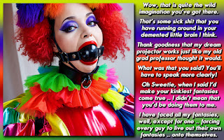
For some reason, this picture posted in Mey's caption folder really struck a chord with me. I just kept WRITING and WRITING, until I had a huge amount of words to fit into the text box. Usually, at most I have to shrink the text a bit or squish it some, and adjust the spaces between paragraphs.
This caption, however, had at least two extra paragraphs that I had to account for. I made the text smaller than usual to fit more in (I like to use a 24 pt font in captions, sometimes 30 pt, with the paragraph spacers being 12-14 pt.) Even then, it was overflowing.
I had to do a huge pruning and editing job to get it where it needed to be. unlike much of my work, I REALLY needed to set up the caption, and to show the motivation for WHY he was dressed up like that. I also had to connect the dots to the ending I had planned. Using myself as the catalyst seemed the best way to KEEP Meygan in skirts. I also had to setup that finality somehow without overwhelming the story, and yet tying it all together neatly.
I ended up tightening up sentences as best I could, by economizing what needed to be said. I wish I had kept everything I had written for it, as a comparison for this blog, but working exclusively in Photoshop meant I'd have had to make a conscious effort to save it.
Having said all that, I think it is STILL a really effective caption, which conveys a sense of entrapment and humiliation, with a bit of hope that he pulled it off, THEN the whole moment of truth arrives anyway. Also, the fact that he originally dressed up like that because of pride, yet the ego played into his downfall, is another wonderful element I enjoyed seeing.
The one thing I didn't put into it was Dee's motivation for all this. I had it worked out that the wife was bi-sexual, and had an affair with Dee beforehand, and I didn't particularly like Matthew marrying her. I figured that the caption worked just as well, if not better, with that information withheld.
SIDE NOTE: I used the term "future wife" as a fun little aside to "The Room" which is a "horrible but in an awesome way" film. Since the writer, star, etc .. is not necessarily a English first writer, he never uses the word fiance .. it's always "FUTURE WIFE" so I wanted to have fun with it.
DISCUSSION: Did I do a good enough job of whittling down this into one caption, or should I have tried to make it a small series? I didn't want to make the picture smaller or really crop it, and she hadn't posted another picture if that was part of a set. Could I have edited it more while keeping the story intact?


The "Caitlyn Virus"? Ouch. I've tried many different antidotes and not a single one has helped yet. Watch out for the ointments... they make it worse!
ReplyDeleteI think you did a fine job of whittling it down. Every part in the cap is important and helps set up that wonderful ending. As for editing it down further... well yea, the entire story isn't NECESSARY for it to be a great cap, but it wouldn't have been THIS great cap. Taking any of the remaining story out (as I think you've made the sentences just about as economical as possible), would have changed the tone of the cap in some way.
One thing I've noticed as I've been writing more and more is that the canvas size of my caps has gotten larger and larger. When I started capping on a regular basis I started at 900x900. Many of my caps ended up at that size. But with great verbage comes great space requirements. My 'standard' size now is somewhere between 1000x1000 and 1000x1300. I feel that gives me enough space to keep more of what I wrote, without making the cap much 'bigger'. I've also taken my font size down. I try to stay at 18 pt, but will accept (depending on the particular font) as low as 16 pt.
Overall I think you did a great job. It still has that 'Dee' feel, and spins a great story!
I used to make sure all the captions were no bigger than 850x850, which was due mostly to the Haven having a 300k file size limit. Those dimensions usually kept the file within the 280k size, plus not everyone had wide screen monitors.
ReplyDeleteNow I have bumped up to about 900-925 for the width. I hate having to scroll across to read a caption. Its a huge pet peeve of mine. I don't really mind scrolling down, but across REALLY takes me out of the mood.
Hmm.... that makes me wonder if I am doing that? Making people scroll side to side. I keep my desktop resolution at 1920x1200, so none of my caps scroll side to side, but I know a lot of people don't have that wide of a resolution. I'm gonna have to research that some more. Thanks for pointing it out.
ReplyDeleteI keep my screen at 1680x1050 at home and work. To be honest, I'm not sure I could go higher if I wanted to, but its a comfortable size for me. I don't mind large caps if I am viewing them in a picture viewer per se, but in the Haven, with the left side bar, and the forum format, I think you only get about 1000 pixels for a width.
ReplyDeleteThat is one of the great things about your blog, is that clicking the caption gives you a full size that fits onto the screen.
I never really gave much thought to people viewing the haven on a netbook or tablet. I know those people are out there as the blogger stats tell you that people are viewing on iPads or even on a Nintendo DS.