

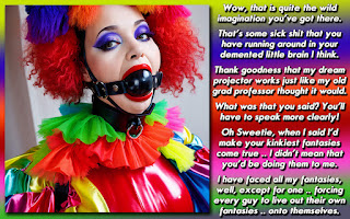
This is a cautionary tale .. about making sure your preferences are kept up to date and detailed, while still leaving room to let captioners be themselves. The person I made this for liked to be humilated, so I thought I would oblige them. When people are relatively new, I try not to go too overboard, but the preferences were pretty much daring me to make something ..
As you can probably tell ... I love HUMILIATION!, there is nothing I enjoy more than being mocked for how girly and prissy I am becoming during the process of feminization. This is not a must in a caption but for me personally I think it adds alotWell, from that, I made the caption up above. I had a feeling that I had gone a BIT too far in the picture though, so after I posted, I sent a PM saying that I could change it if it was too much. About 3 hours later I got the "I'm not really diggin the picture" aspect. To be honest, I expected that response, but I figured the picture is what made the humiliation aspect work. They wanted "realistic, not magic" for their caption, and I thought I hit that right on the head. If you looked like a covergirl, you'd probably lose quite a bit of the edge. "Oh noes! I look better than 98 percent of the real women out there! What ever am I going to do?" I probably could have found a picture that went half way between what I portrayed in the caption and a real woman, but I wanted to see how much is too much.
I love the idea of being trapped in my new feminine role, such as giving me permanent makeup, taking away all my male possessions, or putting me in a situation where I have to keep acting as a girl
Anyway, about 10 minutes later, I took what I had, edited it a bit, and then wrapped it around another picture.

This version works well too, but to me, it doesn't have the SNAP the original does.
DISCUSSION QUESTION: How do you feel about each caption, and which one do you like better? I am guessing that most people will like the second one much more. Why do you prefer one over the other?


I believe the first caption has a little more oomph to it. The over the top frilly, prissy, pansy dress and the over the top hairdo and makeup work better with the story. I may have enjoyed the second cap more if I hadn't seen the first. But after the seeing the first cap, I can only see the compromises made. The picture, while still pink and frilly, doesn't have that same humiliating edge to it. And even the story, by losing that second paragraph, loses its edge.
ReplyDeleteNow I should say that neither are really to my liking. It's nothing specific about the caps, its more to do with my preferences. It's just not the type of humiliation that gets my engine going. But that being said, the balance between the text and picture is better in the first cap. It feels more 'Dee' to me than the second one does.
So if I had to pick one that I like better, I would have to go with the first. If I had to only pick a picture that I like better, I would go with the second.
Dee,
ReplyDeleteThis is a little hard for me to judge, being a little outside of my wheelhouse.. :)
I would think the first pic to be far more humiliating... They's both be bad, but my lord, the level of effort with the makeup, the wig, the outfit. It's incredible. To think that that person might be unwilling staggers the imagination!
Yeah, the second pic is pretty bad, but the humiliation factor is cut by the relative lack of details. She looks totally topless, makeup is minimal. Basically, just hose and heels. And a boa. Embarrassing, sure, but humiliating?
You could maybe get a guy a little drunk and get him in fishnets, but full-on Drag Queen/Sissy? How does he explain THAT away?
For the story, the pic, and the presentation, ALL my votes go to the first one. Sorry to be the voice of dissent :)
Oh Dee - being so much you.
ReplyDeleteI find it interesting you picked the first image from those preferences. If would have never crossed my mind because I keep seeing "forced to act girly and prissy." In my experience most who write something like that equate that to as close to girl as possible. If I had seen the word "sissy" or "drag queen" i might have thought to use that picture.
If you are going for TRUE humiliation, as in full on embarrassment and shame the first picture is the obvious choice. It's a weak facsimile of femininity; a gross over exaggeration. It's more akin to a clown than a woman and that would be the embarrassment in itself. In that case I feel it goes from being about femininity to being about wanting/needing attention.
The second picture might be more humiliating to an actual woman I think - being forced to act like a wanton slut with no brain. That seems more in line with most "humiliation" fantasies I find prevalent in captioning.
As for which I think works, I feel the right one is the one that fits the preferences best. That's always the right answer when you make something for someone. It's their fault for not being clear.
@ Cailtyn
ReplyDeleteDo you think the caption would work if I used the "wording" of the 1st one, and the picture from the 2nd one?
I tend to think the pictures work best with the "plot" I've given them, since the photos seem to have different tones.
@ Steffi
I think you are reinforcing what I was saying in the original post. I also have no problem with people having a voice of dissent. I can definitely be one to flog convention and go against the grain.
Back when I was just a mere "writing coach" I'd go back and forth with some other Havenettes about all sorts of "rules in regards to captions". Usually we'd just end up agreeing to disagree.
I was a young teen during Iran/Contra, and that really made me question everything. It wasn't hard to see that there were always 'three sides to every story' and 'more than one way to skin a cat'.
Dee, I think you were right to delete that section of the story out in the second cap. In the first cap it compliments the photo as her look is so over the top you can believe that they didn't want her to look like a girl. The second photo is far to feminine, so it would clash with it. To make it work (in my opinion) you would have another paragraph similar to the one in the fist cap, but more along the lines of how they made her look like some slut that would sashay around town.
ReplyDeleteAnd I hear you on opinions. Its one of the reasons I dropped the idea of making a critique blog. Sure we could all offer our opinions, but that doesn't make us any more right than the next artist.